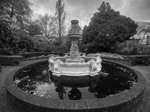
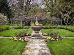
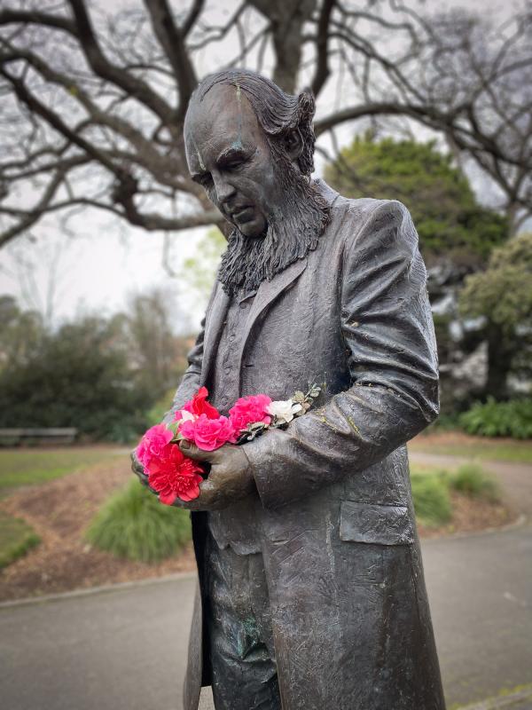
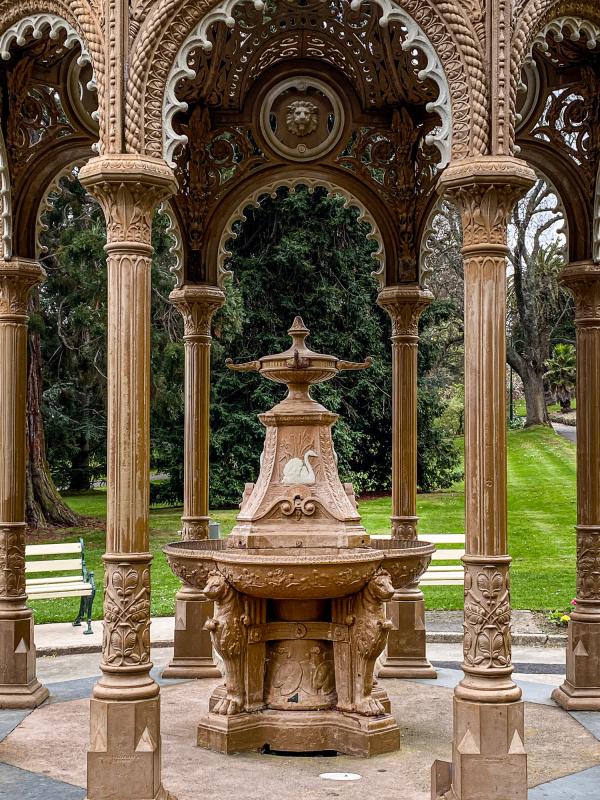
Over a weekend bookended by running Mark Gray 5 day Tasmania workshops I was lucky enough to get to walk around Launceston as a tourist. The iPhone 11 Pro is no DSLR replacement but it's surprisingly good for practicing and improving composition skills.
A comparatively short but rich history
Having grown up in Australia any building over a century in age looks ancient to my eyes. I know that there a plenty of buildings standing around the world that make our oldest structures look barely worn in. But, growing up here if I see a date on a building that starts with "18", it seems like it belongs to a time so different to the present. A time where buildings had detail galore, both inside and out. A time where even buildings with simple, practical reasons to exist where designed and constructed with flair and care. I may be wrong, but I can't imagine too many people lining up to get a glimpse of the interior of a current bank headquarters like they do to see the Manchester Unity building in Melbourne.
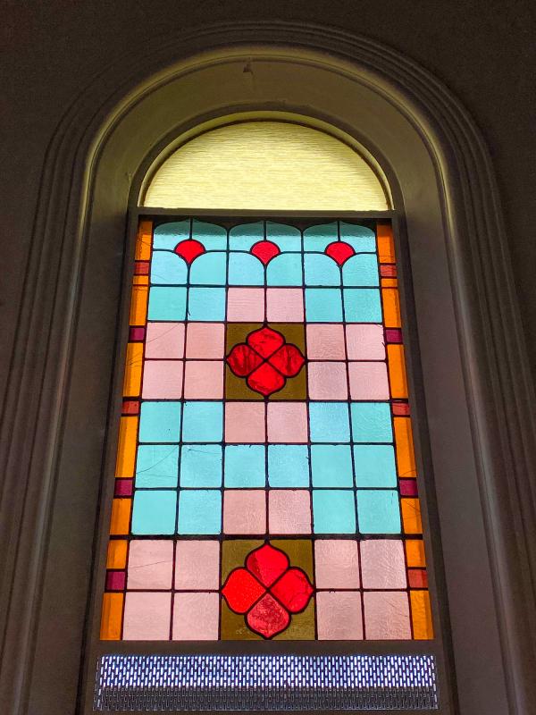
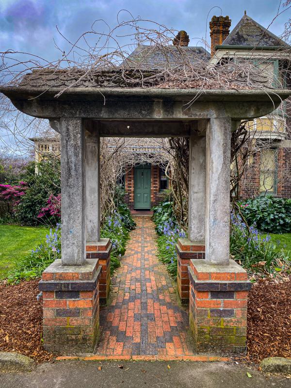
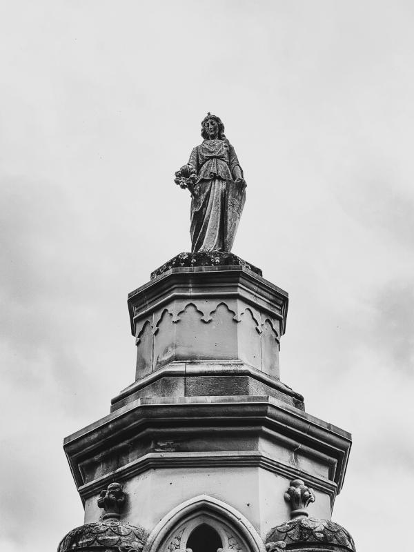
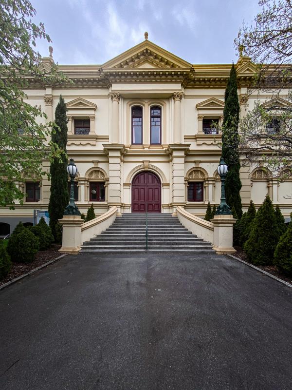
Probably the most striking thing about Launceston is the sheer number of 19th century buildings that, not only are still standing, but are in beautiful repair and current use. While there are numerous modern buildings all around Launceston each of the older buildings has contemporaries within sight that allow the eye to cast back to yesteryear and easily visualise when all of the architecture was of that ilk.
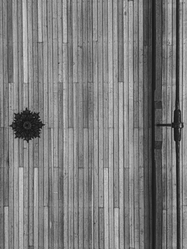
In looking through the gallery below one of my habits (possible obsessions) is looking for symmetry, or near symmetry, where it's available.
In Lightroom Classic I also fine-tuned the original images to perfect horizons and cropped to achieve visual balance. While processing I couldn't decide between colour or monochrome for a couple of images and so both versions are included below.
Moving on from large, long-lasting structures
As I was walking around the Northeast section of Launceston CBD near my accommodation, I stumbled upon City Park. What a fantastic find. There's a number of interesting buildings and other minor structures. There's even a monkey enclosure.
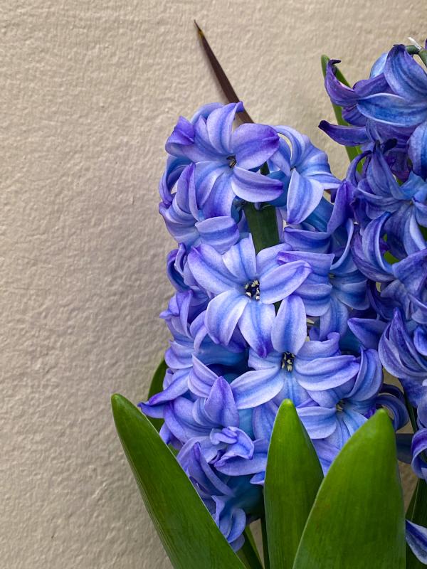
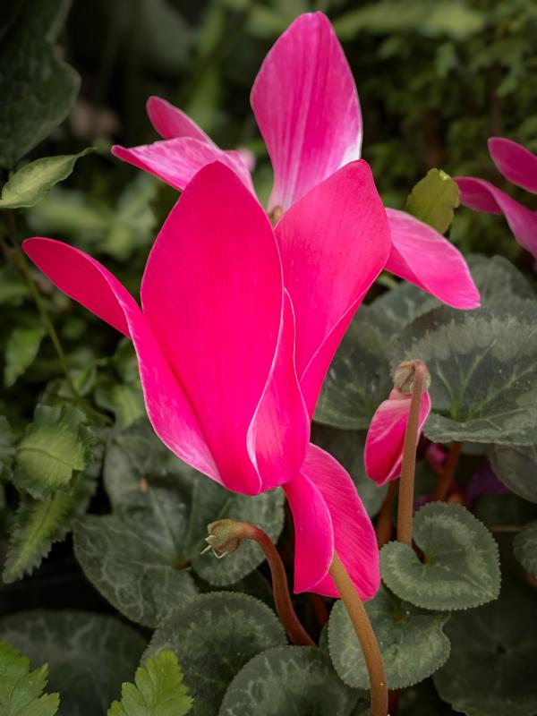
But what caught my eye was the John Hart Conservatory. Full to the brim with blooming flora it was hard to concentrate on perfecting a shot of one species before moving on to the next.
While symmetry like in the shots of the buildings above may not be available here there's still much repetition of similar shapes to allow the photographer to find a sense of balance among a scene that could easily be too busy or too bland.
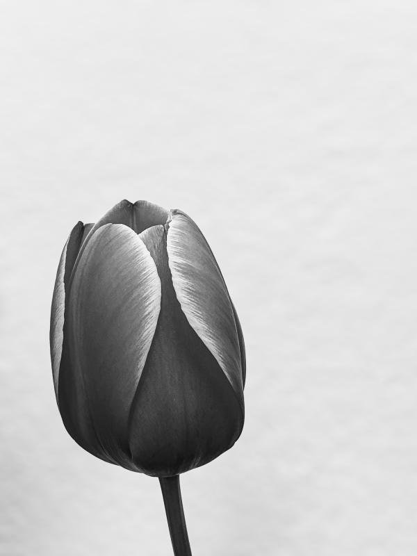
One of the images that I created at the conservatory was of a red and yellow tulip. Similar to the image at the top of this page, but in a vertical rather than horizontal format, I was moved to convert the image to black and white. My motivation for this was that the structure of the light falling upon the stem and petals was, to my eye, more striking than the color of the flower itself.
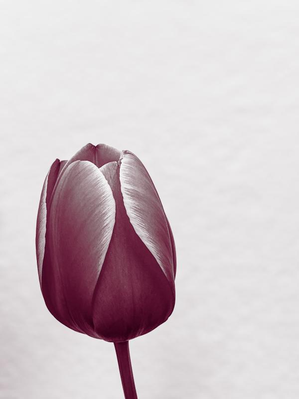
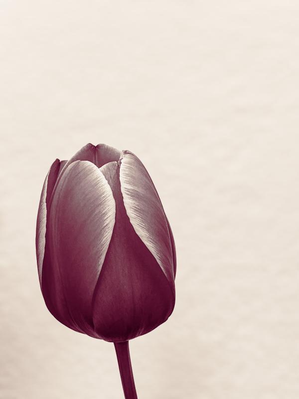
Once I had completed my monochrome edit on the file I also made a couple of virtual copies in Lightroom Classic and then applied colour grading to them to create a pair of duotone versions of the image. One where I shaded the shadows with a fuchsia tone but left the highlights neutral and another with the fuchsia shadows and added vanilla highlights.
The Color Grading tool, and indeed its predecessor the Duotone tool, are often ignored or, at least, underutilised by many photographers. It is a tool that can be used in quite obvious ways (as shown below) or can be used so subtly that the effect is not obvious but can be quite powerful.
The run of green storage units flows all the way into the bedroom, where the units serve as wardrobes. A tangerine ceiling treatment marks the walkway through the home. It also helps to zone the one-wall kitchen from the lounge.


