When I look at most images after download I instantly know what post processing style I want to go with. But not always. See the evolution of this image into it's final two forms.
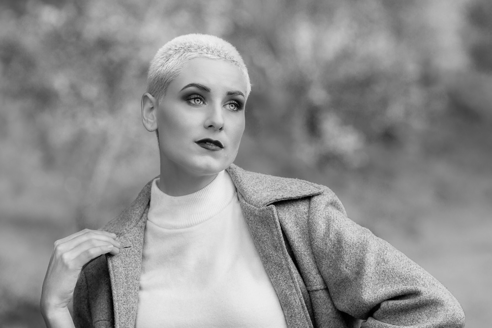
Original Image
Straight Out of Camera
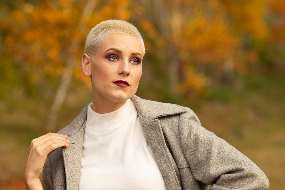
This is the image as it opened in Lightroom Classic.
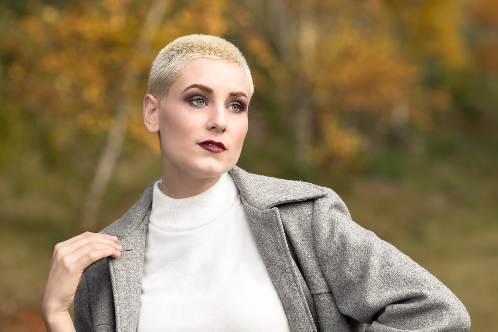
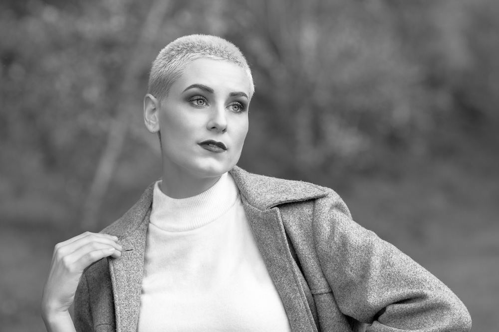
Original Image
Basic Post

Once the basic post production such as white balance, exposure, sharpening and skin softening were done.
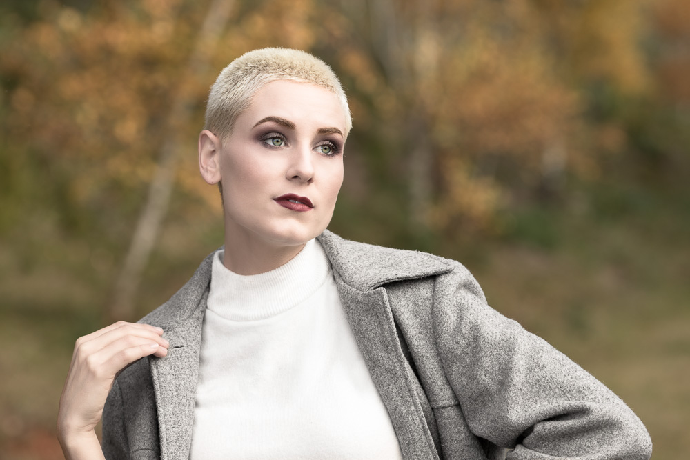
Fix Clothing

Opened in Photoshop and creases and folds Natalia's jumper were fixed and/or reduced using the Generative Fill tool.
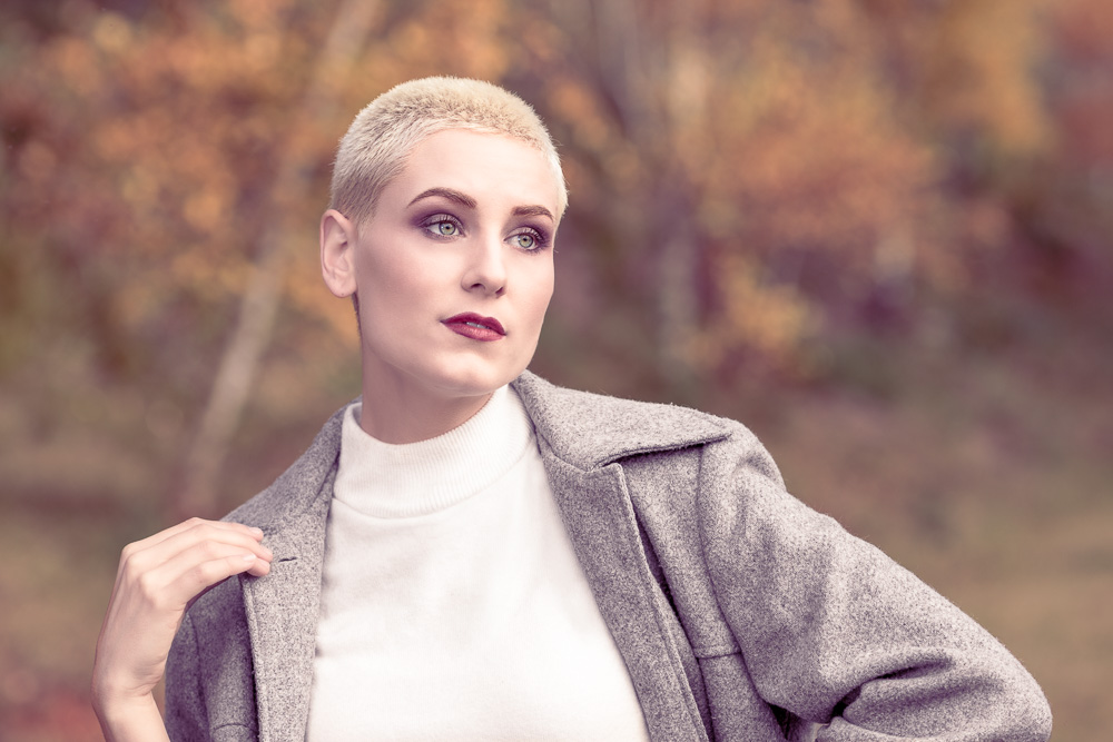
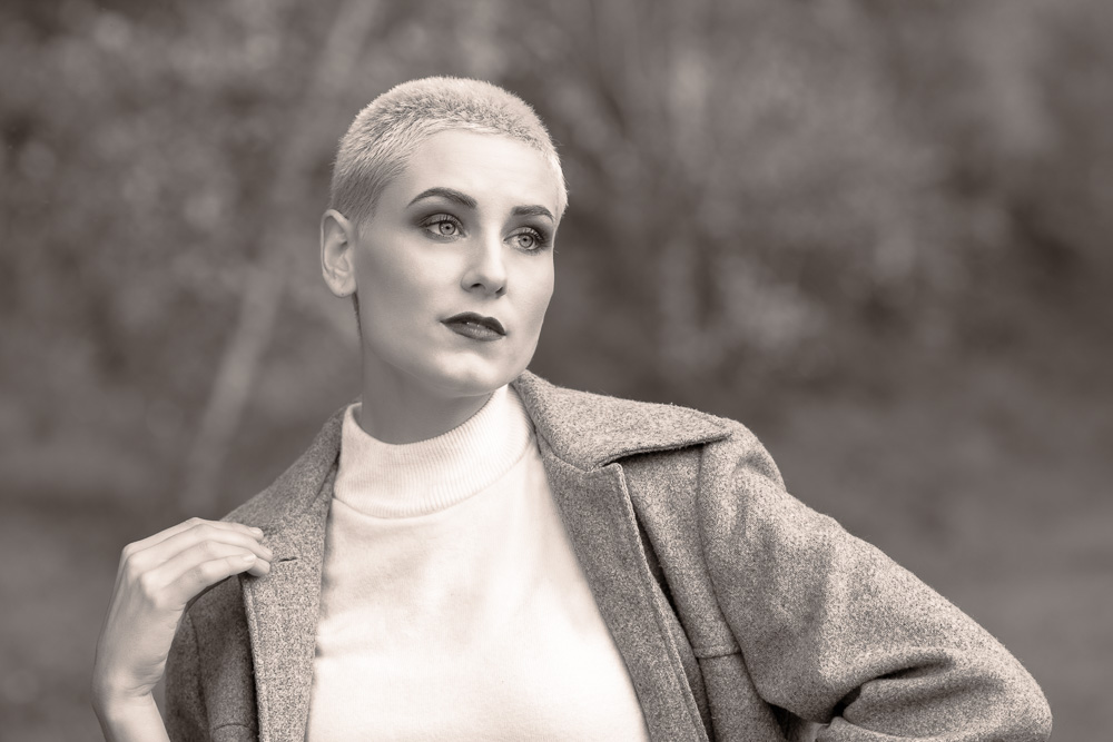
First Colour Version
This image was shot on a Canon 1Dx and Canon cameras are famous for generally good but somewhat ruddy skin tones.
I liked the general look of the image but wanted to back off the saturation of the image.
Using the Saturation slider in the Basic panel would basically do what I wanted but can make the rest of the image look flat once the skin is perfected.
So l tried an old trick that I learned years ago.
This image is the same as the image above except the Red Saturation slider in the Calibration panel was set to -26. This backs off the saturation of any pixel containing any red but is particularly good on skin tones. This change leaves punch in the sections of the image that should stay rich but backs off the skin tones.
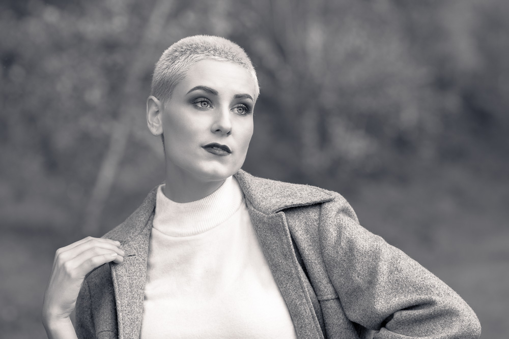
Second Colour Version
This image is the same as the image above except that the Red Saturation slider in the Calibration Panel was changed from -26 to -72. This is quite a severe change and does start to "grey off" the image. So the whole image, which is comprised mainly of red containing warm tones, is noticably less saturated than even the real world would have been. However, this has created the "porcelain skin" look that has been a staple of fashion photography since colour was introduced to photographs.
Another way of achieving the porcelain skin would have been to create a mask covering only the skin and playing with tools like the Saturation slider and maybe the Temperature and Tint sliders to perfect the skin. One possible problem with this technique is that the rest of the image stays unchanged and can make the image look edited as one portion of the image doesn't quite gel visually with the rest.
Third Colour Version
While the previous image is a perfectly usable fashion style image it might be said to look a little flat. One way to add a little pizzaz to an image, and they do it in movies all the time, is to use colour grading tools.
This image is the same as the image above except that the Shadows and Highlights wheels in the Color Grading panel have been adjusted to add colour to the image while still keeping a soft, desaturated look. The Shadows wheel was set to Hue: 275 and Saturation: 69 to add a warm purple colour to the darker portions of the image. The Highlights wheel was set to Highlight: 26 and Saturation: 14 to add a subtle orange tone to the lighter portions of the image.
That's it, that's exactly what I was looking for. Punchy yet subtle. Striking yet believable.
First Monochrome Version
While I was happy with my final colour version of the image, there was something about the way that the light fell across the model that made me think that a monochrome version of the image may be just as powerful.
I opened up the Presets panel and moused over quite a few monochrome presets until I saw one called "Infrared" that grabbed my attention.
Second Monochrome Version
There was a lot to like about the Infrared preset treatment of the image. It had a lot of visual impact. However, the more I looked at the image the more I came to not like what it was doing to Natalia's eyes. She has quite a striking look naturally and I didn't want to make her look like an alien. Also, the Infrared preset tended to make Natalia and her clothing blend into the background rather than stand out from it. This is something that can be fixed with localised masking but I prefer a preset or a profile to be heading in the right direction without too much masking.
After a quick look at the effect of a few other presets and not finding anything that truly grabbed me I decided to try another monochrome technique of setting a monochrome profile rather than preset.
So, I undid the preset and opened up the Profile Browser and moused over the monochrome profiles until I saw one that I loved the look of. Then, with very minimal fine tuning of exposure type settings in the Basic panel I was happy with the monochrome version.
Third Monochrome Version
I love monochrome images. But, when they are printed absolutely neutrally (with the greys being printed as perfectly grey) they can look a little cool to the eye in many rooms. So, especially with portrait or fashions shots, many photographers will slightly warm up the greys so that the image reads as neutral to slightly warm when printed and viewed in common room lighting scenarios.
For this version of the image I used the Shadows and Highlights wheels in the Color Grading panel to warm up the image. The Shadows wheel was set to Hue: 34 and Saturation: 17. The Highlights wheel was set to Hue: 38 and Saturation: 30. This is an overtly warm setting and is a stronger setting than I often use. However, having worked on the colour versions in the same editing session I think I was chasing a little of the Autumn warmth of the coloured versions.
Fourth Monochrome Version
When looking at the above image I wasn't quite satisfied with how it looked. It didn't look bad, but it seemed to be missing something striking that the final colour version had. It was the porcelain skin.
The answer was to change the Highlights wheel settings to Hue: 35 and Saturation: 13. This backed off the obviousness of the highlights being warmed. The effect was still there but it was much more subtle.
The next step, strangely enough, was to cool down the shadows by tinting them with a blue tone. The Shadows wheel settings were changed to Hue: 236 and Saturation: 17.
This created exactly the image I was looking for. Striking, not because of heavy handed post processing, but because the model was wrapped in beautiful light when I shot. The post processing just had to reveal the beauty that I'd captured when I pressed the shutter release button.
The Final Results
I now had two versions that created the visual impact that I was looking for. One colour, one monochromatic. One happy photographer.